
Docu Care
Project: Docu Care Role: Sole UX Designer Duration: 3 months
Project Vision
This patient record management app was designed to streamline documentation and information access for primary care providers. Inspired by real clinical pain points, the goal was to reduce administrative burden and improve care delivery through a responsive, user-centered platform. The MVP was developed as a mobile-first application, with a complementary web-based experience, to ensure flexibility in diverse clinical settings.
Challenges & Solutions
Challenges:
Document patient records efficiently for quick and accurate data entry
Securely store sensitive patient information while keeping it organized
Enable rapid referencing of patient records during consultations
Kickoff
To begin the design process, I used a goal-driven approach to clarify my objectives and user priorities. I focused on qualitative research strategies such as background reading, competitor analysis, stakeholder conversations, and persona exploration to better understand the problem space. These early steps helped me define a strong foundation and ensure I am solving the right problems for the right people.
“What kind of solution are we building, and who will use it?”
“What are the biggest pain points for our users right now?”
“Which users should we focus on first?”
“What risks or barriers might arise in our design process?”
“Who else is building similar solutions, and how?”
“What existing research can give us helpful context?”
To better understand user pain points, I created an affinity diagram to organize feedback from user interviews. I grouped insights into key themes: documentation workflow, information retrieval, staff collaboration, and system usability. These were then categorized under broader goals like efficiency, clarity, and user confidence. Users expressed frustration with tasks like entering vitals, finding patient records, and unclear navigation. By mapping these challenges, I was able to identify shared pain points across roles and prioritize features that improve day-to-day workflows while supporting clinic goals.

Affinity Diagram
PRIMARY
Name: Dr. Denise Jackson
Age: 41
Occupation: Primary Care Physician
Dr. Patel juggles a busy schedule of back-to-back patient visits. She needs a system that allows her to quickly document interactions without disrupting patient flow. Efficiency and clear access to past visit notes are essential, so she can focus more on care and less on clicking through tabs.
Meet the Users
SECONDARY
Name: Luis Moreno
Age: 29
Occupation: Medical Assistant
Luis is responsible for patient intake and initial documentation. He’s often frustrated by having to enter the same data in multiple places and struggles with finding where to log specific details. A streamlined, intuitive workflow would help him stay accurate and on time.
SUPPLEMENTARY
Name: Margaret Thompson
Age: 55
Occupation: Clinic Administrator
Robin supports the entire clinic team and manages records behind the scenes. She values real-time updates and accountability—knowing who made changes and when. A reliable system that supports collaboration and minimizes confusion keeps the clinic running smoothly.


Competitive Analysis
To understand where The app could stand out, I conducted a competitive audit focused on usability, accessibility, design clarity, and clinical relevance. While several tools exist for documenting patient records, few are tailored to the needs of small local clinics. The app has the opportunity to bridge that gap by offering a simple, streamlined interface that balances functionality with ease of use.
Although no competitor aligns perfectly with the target users, I analyzed four relevant platforms, two direct and two indirect:
Key Observations
Robust Tools vs Overwhelming Interfaces
Flexible Systems vs Lack of Medical-Specific Features
Bright, Busy Layouts vs Calming, Focused UI
Enterprise-Scale Integration vs Limited Clinic Usability
Preparing the Journey
We constructed a user flow to map out how healthcare professionals interact with the DocuCare app, starting from launching the app to completing tasks such as uploading patient notes or referring a patient. This journey allows us to identify key interaction points and ensure smooth navigation through both primary and secondary user goals.
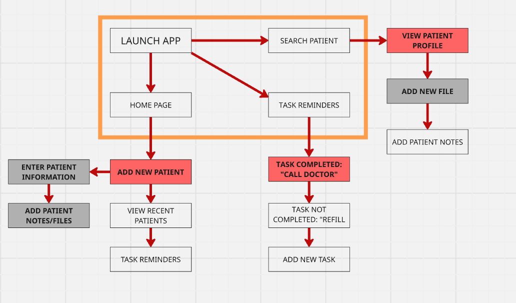
Wireflows
After putting together the low-fidelity wireframes and sketching out the basic user paths, I took a step back to evaluate what really needed to be there. I identified areas that felt cluttered or confusing and decided what features were essential to the core experience. This phase helped me clean up the flow and make sure each screen had a clear purpose. I spent extra time refining transitions between pages to make the navigation feel more intuitive. Before jumping into visuals, I wanted the user journey to be as smooth and thoughtful as possible.

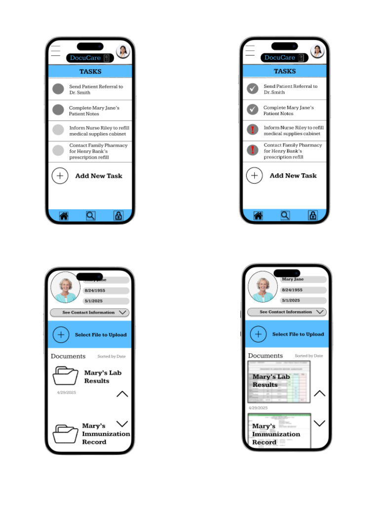
After completing the low-fidelity wireframes, we transitioned into building out the high-fidelity prototype of DocuCare. To ensure the design met user needs, I developed a usability test and ran it alongside a 12-question feedback form to capture thoughts and reactions from participants. A total of 8 users tested our clickable prototype, running through common healthcare documentation tasks like adding a patient, uploading files, and completing task lists. The insights we gathered were instrumental in shaping our final iterations.
Not enough hierarchy.
Several participants noted that elements on the home screen blended together, such as the “Add New Patient” button and the recent patient list. In our updated version, we introduced clearer visual hierarchy and spacing to prioritize user actions and reduce confusion.
Unclear task progress.
On the tasks page, participants weren't always sure whether an action had been completed. We added clearer visual indicators (like checkmarks and greyed-out buttons) to signal task status and reduce ambiguity.
Iterations


Search friction.
While testing, users found that searching for a patient required too many steps. They expected quicker access from multiple entry points. In response, we made the search bar more prominent and added it to the navigation bar for easier access.

File upload confusion.
The file upload screen in the low-fidelity version lacked feedback after selecting a document. In the high-fidelity iteration, I added confirmation messages and a preview of uploaded files, which reassured users and improved usability.
Challenge 1:
Documenting Patient Records Efficiently
Doctors and nurses needed a way to quickly enter and update patient information without disrupting their workflow.
Solution: The app includes a prominently placed “Add New Patient” button and a streamlined entry form with clearly labeled fields for name, date of birth, contact details, and notes. Common tasks such as uploading lab results or updating patient notes are just one tap away, reducing time spent navigating menus.
Challenge 2:
Securely Storing Records
Medical records must be kept private and organized while remaining easily accessible to authorized staff.
Solution: All files are uploaded through a dedicated “Select File to Upload” interface that previews documents before storage, helping avoid errors. The design incorporates patient-specific pages where all documents are grouped by individual, ensuring nothing gets misplaced. The consistent navigation bar and organized tabs make it easy to find the right patient without mixing records.
Challenge 3:
Referencing Records Quickly
Providers needed to locate past test results, notes, and referral documents without delays during appointments.
Solution: A search bar at the top of key screens enables quick lookups by patient name or file name. The recent patients list offers instant access to the most recently accessed profiles. Within each patient’s page, documents are sorted by date and displayed as large, easy-to-read previews, so critical information can be reviewed at a glance without opening multiple files.
Style Guide
This sticker sheet reflects a clean, modern, and highly functional design language intended for a healthcare app environment. The neutral grays create a calm, professional base, while the blues introduce a touch of friendliness and approachability without overwhelming the user. Every element, from the streamlined navigation icons to the patient profile preview, emphasizes clarity, accessibility, and trust. Rounded buttons and simple line icons ensure quick recognition, reducing cognitive load for users who may be in fast-paced clinical settings. Each component here is designed not only to be visually cohesive but also to communicate reliability and care in every interaction.

Link to Functioning Prototype:
https://www.figma.com/proto/72G84Y92cl3a1POFdidZyQ/Wireframe---1?node-id=284-3223&p=f&t=8QYsJRTIfTXsA3XM-1&scaling=scale-down&content-scaling=fixed&page-id=127%3A2&starting-point-node-id=284%3A3223


Takeaways
As someone passionate about creating solutions that improve healthcare workflows, designing DocuCare was a meaningful opportunity to address a real-world challenge in patient record management. This was my first time designing an app, and more specifically for a medical context, and I learned the importance of balancing usability, security, and efficiency. Applying the goal-directed design process helped me better understand the needs of both doctors and nurses, ensuring the interface supports their fast-paced work environment without adding unnecessary complexity. I also realized that in healthcare design, prioritizing the user’s needs is just as important as meeting institutional requirements, if the app isn’t intuitive and quick to use, it can hinder rather than help patient care.